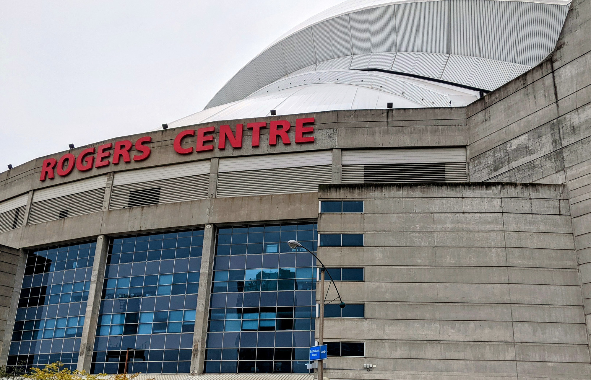
Big changes are on the horizon for Toronto’s Rogers Centre.
The Toronto stadium, which opened in 1989, is somewhat a victim of its time. Once revolutionary thanks to its retractable roof, Rogers Centre was built just a few years before the emergence of the retro-style ballparks that became the norm around baseball starting in 1992. There has been talk in recent years about the construction of a new park in downtown Toronto, but that news cooled quickly when the Blue Jays announced a $300 million renovation to Rogers Centre that would roll out in multiple phases beginning next season.
Leading this project is renowned architectural company Populous, which has designed dozens of sports facilities in North America and around the world. Notable parks on Populous’ MLB resume include Oriole Park at Camden Yards, PNC Park, Yankee Stadium, Citi Field, Busch Stadium, Comerica Park, Oracle Park and many more. In the minor leagues, Populous has designed parks in El Paso, Durham, Fort Wayne, Nashville, Indianapolis and more.
While Rogers Centre has seen a number of upgrades in recent years, including the addition of the center field fan deck, a new video board and a new playing surface, the upcoming changes will be the biggest in the facility’s three-decade history.
On July 28, the Jays released some redesign renderings that shared with fans a preview of some of the changes to expect. The proposed redesign will give the seventh-oldest park in the big leagues more of a contemporary look and feel to augment the fan experience well into the future. Let’s take a deep dive into the renderings, compare them with how the park currently looks and talk about how they’ll change your visit to the ballpark.
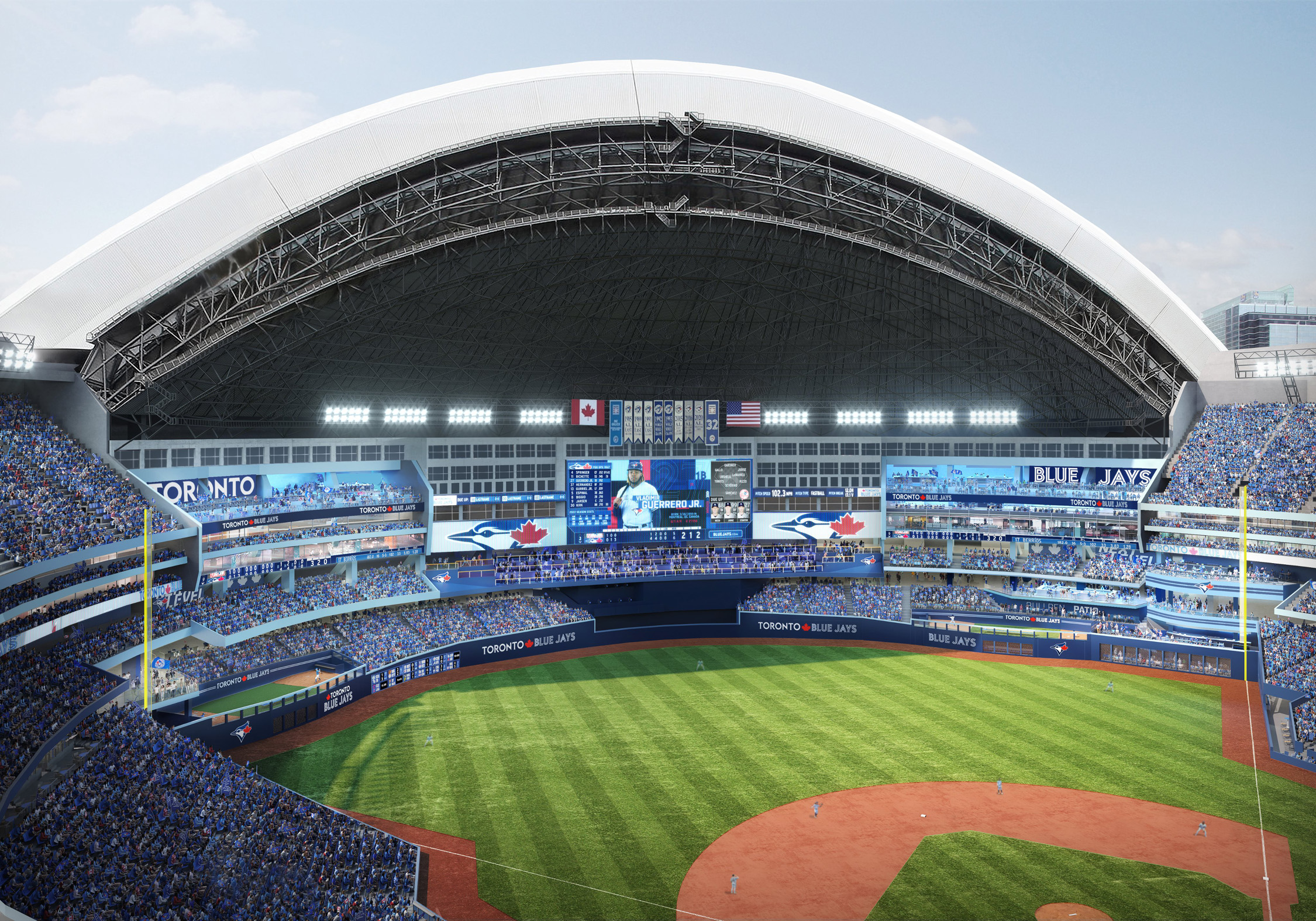
There’s a lot to unpack here, so we’ll start by looking at the first rendering that the team shared on Twitter:
At first glance, it might seem that this rendering is pretty similar to how the stadium currently appears. Look more closely, though, and you’ll start to notice some major changes.
Social Decks
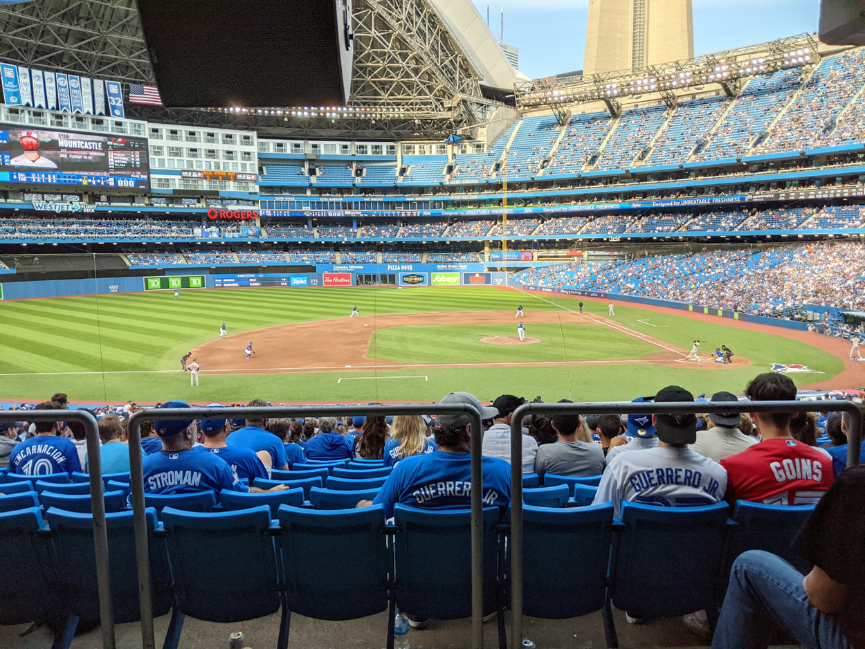
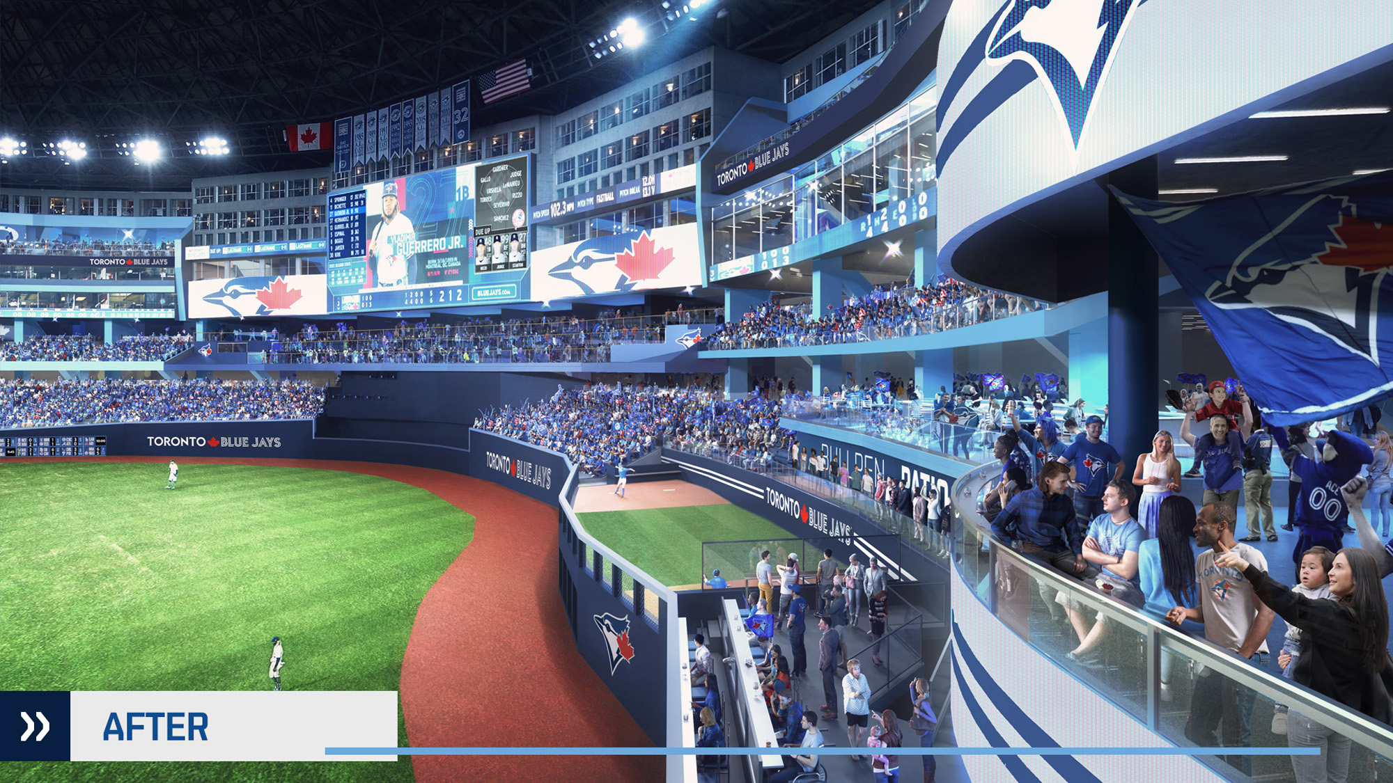
The biggest change is the addition of the two enormous open-air social decks above left field and right field. Currently, the stadium’s 500 Level seating occupies these areas, ending at each side of the hotel above center field. The problem with the current configuration is that outside of Opening Day, Canada Day and postseason games, these sections aren’t anywhere close to being full. Since these seats are getting minimal use most of the time, it absolutely makes sense to remove them and replace them with a fun spot for fans. Case in point: Here’s a look at how empty these seats were when I attended the team’s 161th game of 2021 — a critical divisional game as the team was making a playoff push:
This change will help to add some life to the 500 Level simply because more fans will want to be in this area. For some games, the seating sections above the outfield are closed off entirely, which means that the 500 Level concourse has the feeling of a ghost town. With fans constantly walking to and from these social decks, the concourse should be filled with fans and fun, and more 500 Level concession stands should be open instead of shuttered.
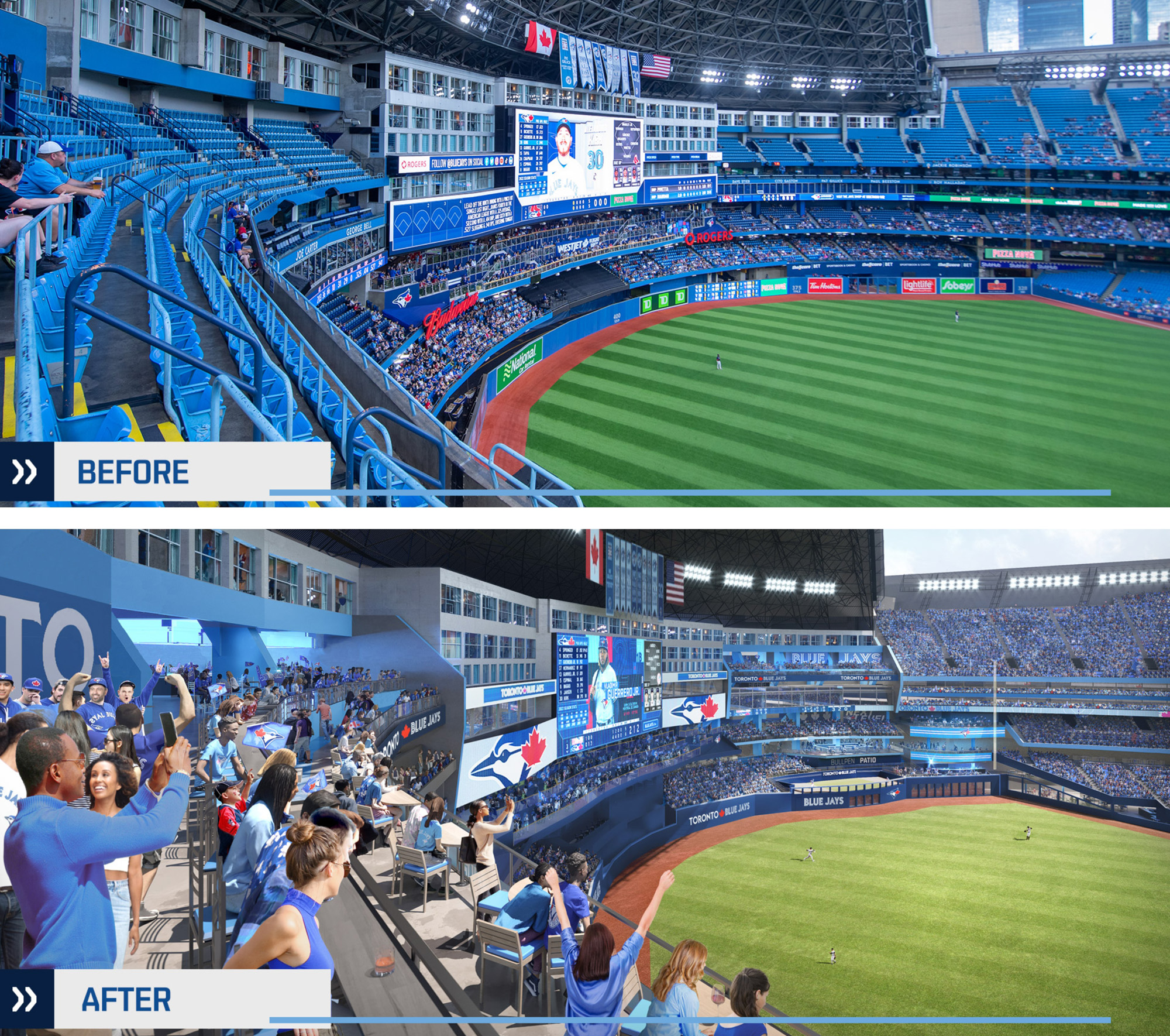
The renderings suggest that the social decks will have a combination of seating options, including bar seating and tables for small groups, as well as standing-room spots. All of these things are pluses. The powder blue look, which matches the team’s “New Blue” alternate uniforms, helps to give these spaces a contemporary vibe.
The WestJet Flight Deck in center field, which has three levels and was added prior to the 2015 season, is the most popular gathering spot in the park. You don’t need a dedicated ticket to access this area; you simply need to show up early enough to secure a spot. Fans love areas where they can mingle with others, enjoy some drinks and cheer on the team, so it’s always a good idea to add more of these areas when possible. It will be interesting to see what approach the team takes to the two new social decks. The fact that the team is referring to these decks as “social decks” rather than “party decks” suggests they’re open to all fans, rather than geared toward private parties.
It might be a good idea to mimic what the Colorado Rockies did with The Rooftop. The Rooftop at Coors Field is a 38,000-foot, upper-level structure that was added prior to the 2014 season. This space was designed by Populous and immediately became one of the most popular hangout spots at the ballpark. It’s open to every fan on a first-come, first-served basis, but has a few private areas that fans (companies, more accurately) can book for group events. This means that any fan who wants to spend time in this area is able to do so, but corporations are also able to book spaces for private gatherings. It’s a win-win.
Here’s an idea of how this area at Rogers Centre currently looks and how it will look:
Outfield Fence
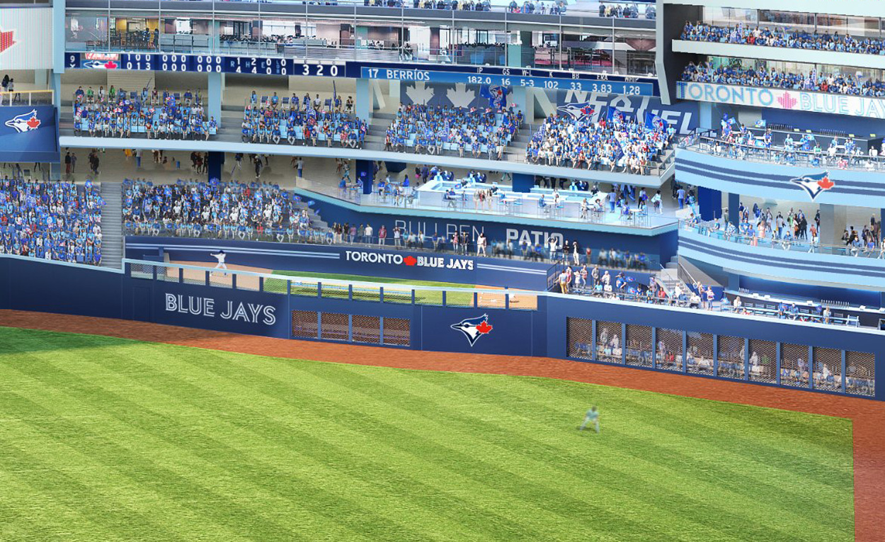
The upcoming renovation will create some significant changes to the outfield fence, which will bring an end to the fence layout that the ballpark has had since it opened. The rendering indicates that the fence will vary in height and also be slightly asymmetrical. (You can see this change in the dual rendering above.) Both bullpens will create pronounced bulbous sections in the fence, with the asymmetry resulting from how the home team’s left field bullpen is closer to the adjacent foul pole than the right field ‘pen is to its foul pole. Here’s a shot that shows the angle of the fence along the front of the visitors bullpen:
Bullpens
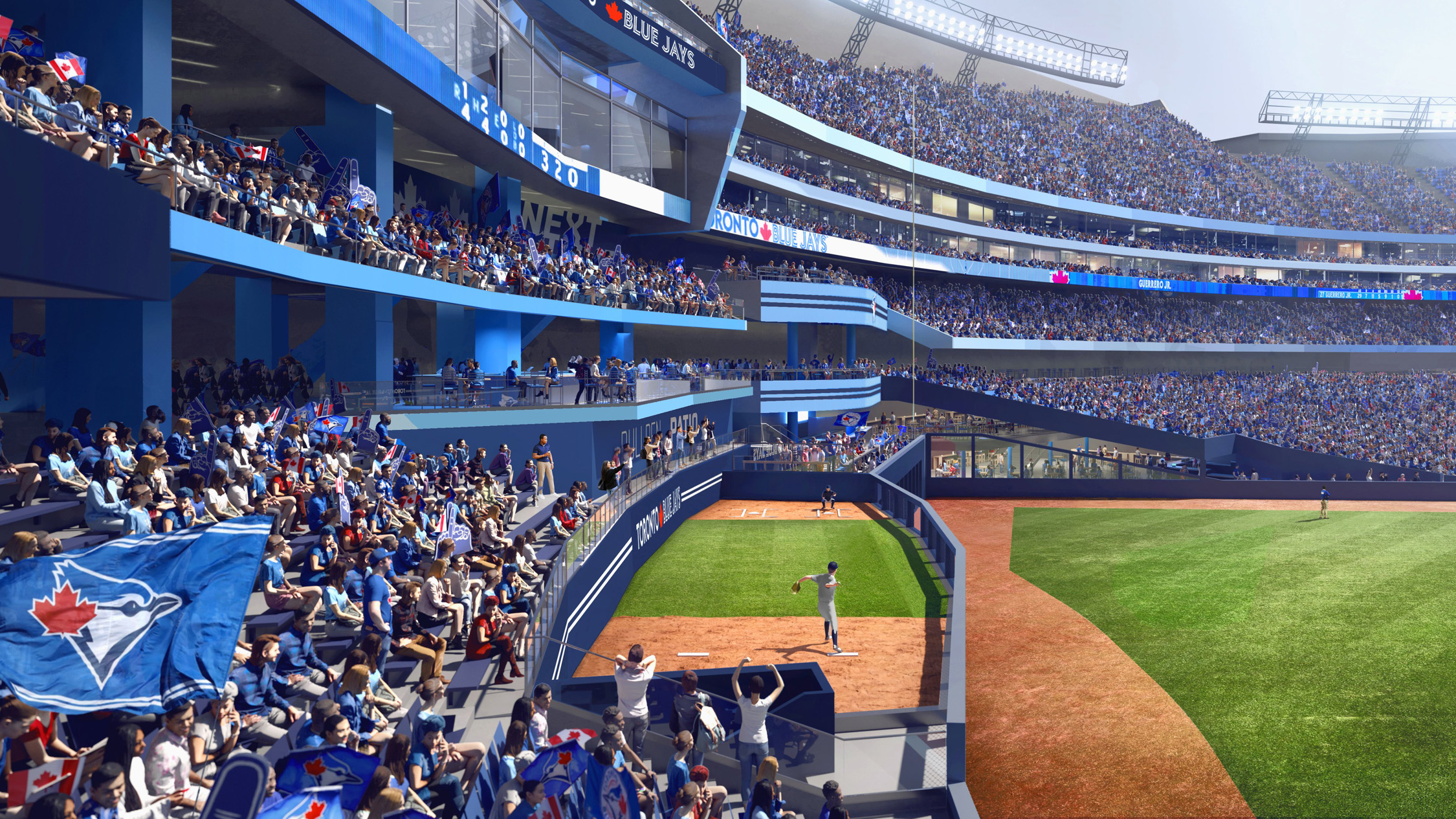
Speaking of bullpens, they’ll undergo some significant changes that will augment the fan experience. Currently, the Rogers Centre bullpens are positioned well below the first row of outfield seats. When you stand in the front row above either bullpen, players in the bullpen feel out of range for autographs and interactions. The renovation will raise the bullpens so that players are much closer to the seats. There will also be a standing-room platform above the home bullpen and platforms above, behind and beside the visitors bullpen. The change will be fun for Toronto fans who want to engage in some playful heckling and not so fun for opposing relief pitchers. Here’s a look at the rendering of the visitors bullpen:
Right Field Bar
As you can see in the rendering above, the ballpark’s right field area will also undergo some significant changes. A large, open-air bar will appear above the bullpen with a narrow standing-room platform known as the Bullpen Patio between the bar level and the visitors bullpen itself. The rendering shows a large bar at field level behind the fence, with an open-style fence that features seating immediately behind it. While not yet confirmed, it seems likely that this exclusive area will be geared toward private bookings and not open to the average fan. Above the bar is another large standing-room space, with yet another bar one level above it. These changes present a marked contrast to the current right field area, which simply features standard stadium seating above the visitors bullpen. Here’s a shot that shows the right field bar area from a different angle:
Seating
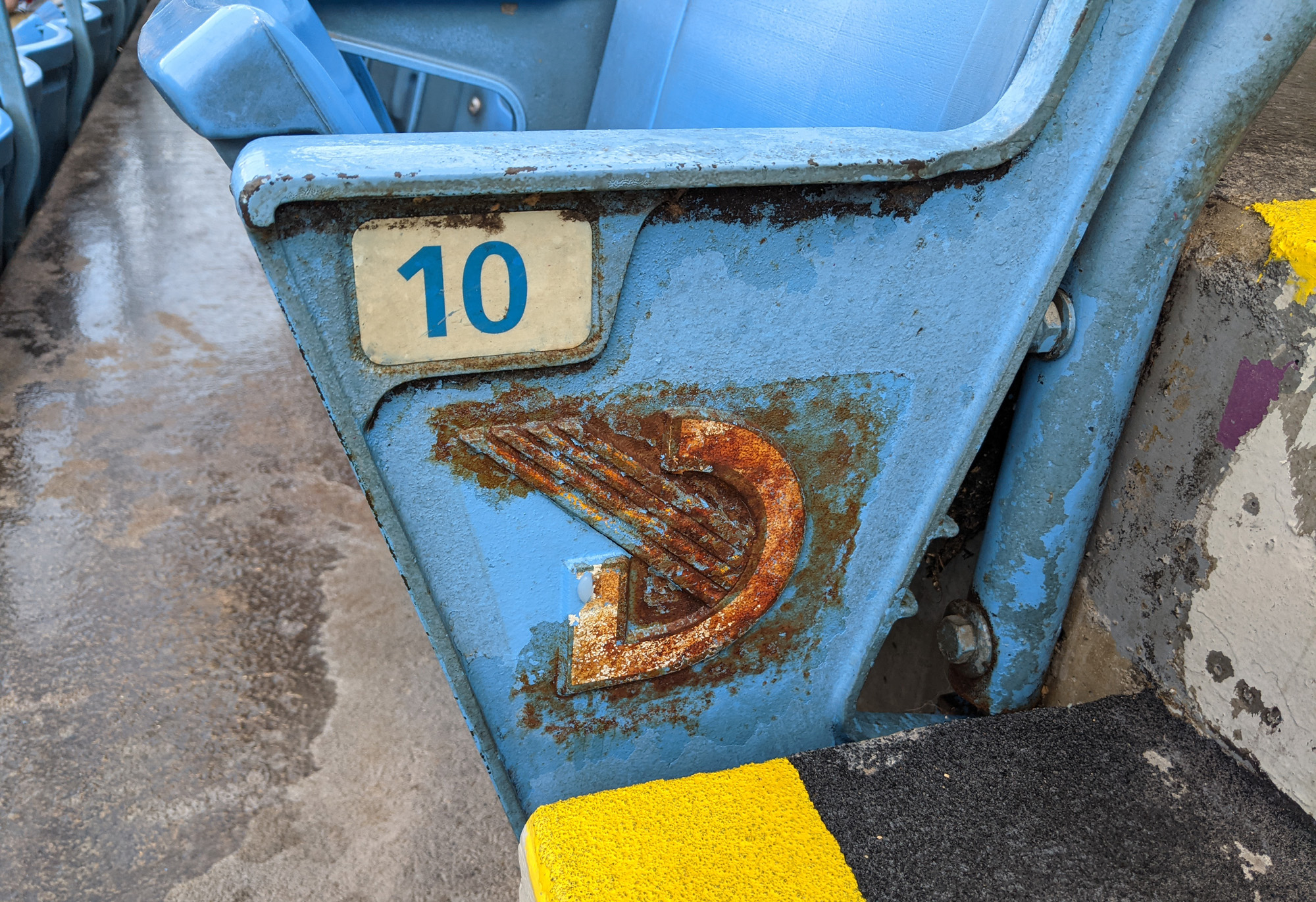
The team will replace all of the 500 Level seats, which will be a welcome change. Surprisingly, some of these seats still feature SkyDome branding, despite the park dropping that name more than 15 years ago. Even those that have new Rogers Centre branding are terribly faded by the sun and have a dated look. Here’s one of the aforementioned SkyDome seats that I noticed during a visit in October of 2021:
Batter’s Eye
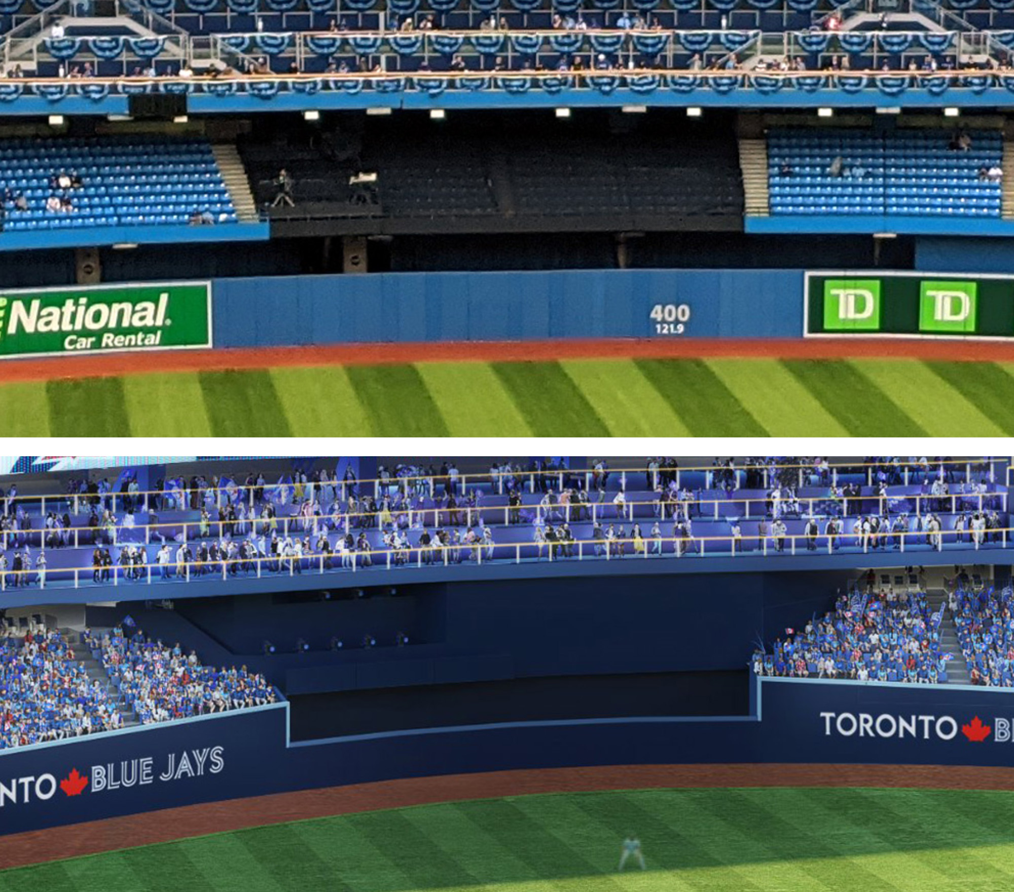
Although it won’t make much of a difference to the gameday experience for fans, the rendering shows some major changes to the batter’s eye. Currently, Rogers Centre has one of the worst batter’s eyes in all of baseball — two large seating sections that are covered in a black cloth. In the rendering, the seats and the cloth have been removed and replaced with a dark blue wall and a large camera bay. A much better look in every way. Here’s one of my shots (top) and one of the renderings (bottom) to illustrate the change:
All renderings are courtesy of the Toronto Blue Jays.
You must be logged in to post a comment.