Virtually every baseball fan has an opinion about MLB’s City Connect jerseys.
Some love them. Some hate them. Others just think they’re a cash grab.
As for me? I expect I would’ve grumbled about their non-traditional look in the past, but as I get older and hopefully mellow out a little, I simply think, Fill your boots, MLB. I love this. Bring on more City Connect.
I enjoy reading about each City Connect launch, frequently comparing the latest design against the others around the league. To this end, I thought it’d be fun to share my favorite designs and see how they compare with yours.
Here are my five favorite MLB City Connect jerseys:
5. Texas Rangers
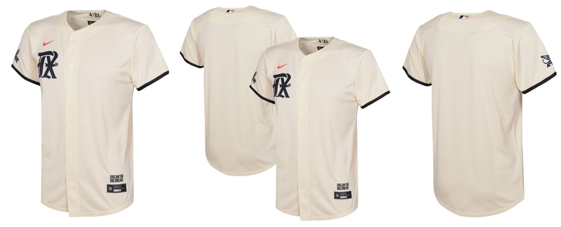
There are a lot of detractors to Texas’s City Connect design, which made its debut in April of 2023. I’ve heard some people say there’s a lot going on with this design, while others critique the design as too simple. As for me, I like what I see. I’ve always been a fan of jerseys that feature a logo on one side of the chest and a uniform number on the other side, and that’s what we get with the Rangers City Connect design. If you look beneath the surface a little, you’ll learn that the design pays tribute to some former minor league teams that played in the Dallas-Fort Worth area. As a big MiLB fan, I love this connection.
I find the font used in the “TX” logo to be stylish and unique, and enjoy the subtle addition of the spur. For some reason, the look of the “TX” reminds me a little of the “RR” logo that the Frisco RoughRiders employ, and this makes me happily recall the two nights I spent in Frisco way back in 2016. Finally, cream jerseys always look better than white jerseys, in my mind, and the inclusion of cream in this design pushes Texas’s entry into my top-five list.
4. Toronto Blue Jays
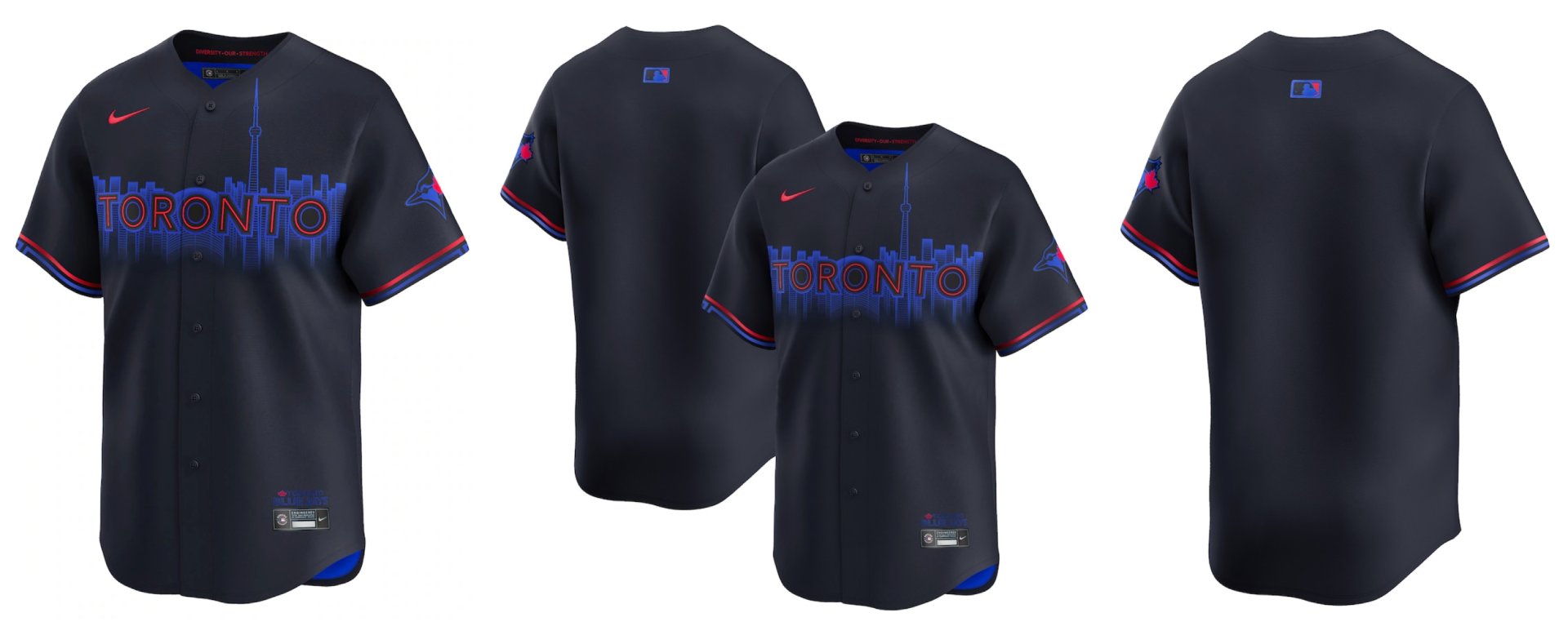
I’ve been a Blue Jays fan for my entire baseball-watching life, but I can honestly say this isn’t a homer pick. Toronto’s City Connect design really caught my eye as soon as it came out in late May of this season. I’m a big fan of city skylines. If I can’t stay in a hotel that overlooks a baseball stadium, I’ll often look for lodging that offers a view of the city. Toronto’s skyline is a great one, thanks to the easy-to-identify CN Tower and Rogers Centre, and they’re both a big part of the City Connect design. I mean, a jersey that actually features an image of the ballpark on it? I’m all over that.
I also appreciate how the design of the “Toronto” wording reflects the famous Toronto sign at Nathan Phillips Square in the city’s downtown. It’s a sign I’ve visited a few times over the years, and its look is instantly recognizable. I’m of the mind that cityscapes look best at night, so Toronto’s decision to use a dark background behind the cityscape is perfect. A cool detail to note is the Blue Jays will only wear this jersey during night games, in keeping with the night theme of the jersey.
3. Pittsburgh Pirates
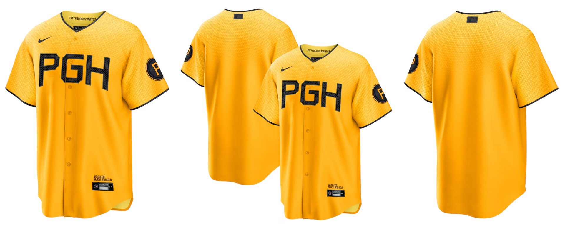
The Pirates keep things simple with their “PGH” City Connect design, but I appreciate it. PNC Park is unquestionably one of the best big league ballparks to visit, and the jersey ties in well. The design, which made its on-field debut in June of 2023, pays homage to not just the Roberto Clemente Bridge, but also the other yellow bridges that are visible from the stadium. Although it’s hard to see from a distance, the jersey design boasts a textured design that directly tips a cap to the bridges. The font used for the “PGH” itself features shapes found in the bridges, which span the Allegheny River and are used by many fans before and after Pirates games.
A lot of teams’ City Connect designs introduce new colors, and I’m relieved that Pittsburgh sticks with yellow and black. It’d be a huge fail to see the Pirates dressing in any other hues. I read an interview in which a Pirates exec noted how the jersey design was kept simple to tie into the city’s blue-collar reputation, and I love thoughtful details like this. A big win for the Pittsburgh fan base.
2. Colorado Rockies
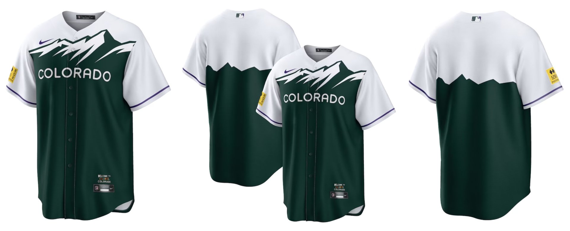
Colorado’s City Connect jersey might be the only design in the big leagues that I feel is unquestionably better than the team’s primary jersey. I’ve never been a fan of the Rockies’ purple look; come to think of it, I’m never that fond of any sports teams that wear purple, for whatever reason. The City Connect look, which debuted in the spring of 2022, features a snow-capped, green mountain range on a white background. I particularly enjoy how the mountains extend across the back of the jersey, too. This overall look, which is essentially a representation of the Colorado license plate design, ties in well really with the team.
I like how the actual Rocky Mountains are depicted. If you’ve been to Coors Field, you’ll likely know you can see the mountains from the ballpark. Coors Field also has the most natural-looking batter’s eye area in the big leagues — a relaxing-looking landscape that features numerous examples of plants that grow in the state. The green in the jersey ties in well with the green in the batter’s eye area. The yellow sleeve patch that features “5,280” lettering, paying tribute to Denver’s mile-high location, also connects well with Coors Field. The ballpark’s famed purple row of seats, found in the upper deck, is exactly one mile (5,280 feet) above sea level.
1. Washington Nationals
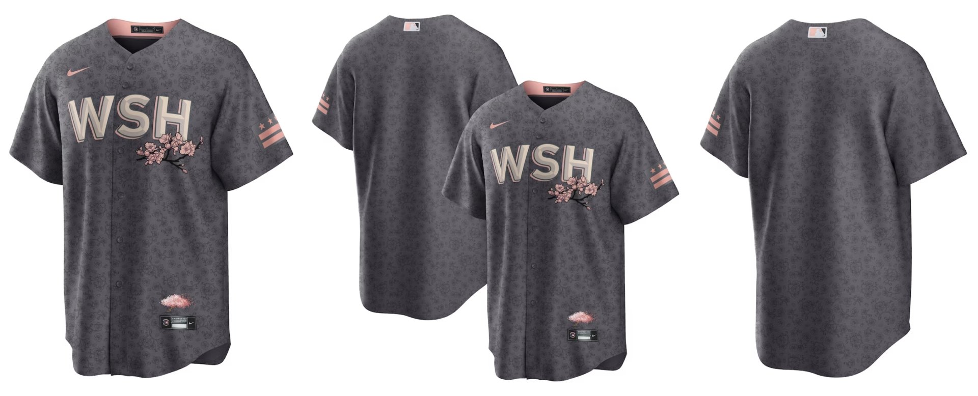
There’s no better City Connect jersey in my mind than Washington’s. This wasn’t a design that grew on me. I immediately loved it when it came out in April of 2022, and I’m sorry that the Nationals are retiring it at the end of 2024. (I love it so much that I bought the jersey last week on MLB Shop before it becomes harder to find.) To me, Washington is synonymous with cherry blossoms, so the incorporation of these blooms into the jersey is just perfect. And this, I think, embodies exactly what the City Connect idea is all about. I can’t deny that I love the smell of cherry blossoms. Their scent is one of the quintessential spring smells to me, and when I think of spring, I think of baseball. It all melds together perfectly. (Plus, cherry blossoms are one of my wife’s favorite flowers. D’aww.)
I also give two thumbs up to the gray design with the subtle pink notes. If you were to look in my closet, you’d immediately know that I’m a big fan of gray attire. Gray all the way, I say. And the gray used in this jersey is just a perfect one. I can’t wait to frame my new Nationals jersey and hang it in my home office.
What are your thoughts on MLB’s City Connect jerseys? Love them or hate them? And which jerseys are your favorites?
You must be logged in to post a comment.